Tag Archives: slide design

Scary Presentations: 10 Ugly PowerPoint Slides

Written by Kevin Lerner

10 of the world’s scariest slides and pathetically bad PowerPoint presentations…and a few PowerPoint makeovers and redesigns just in time for Halloween.

scary-presentations

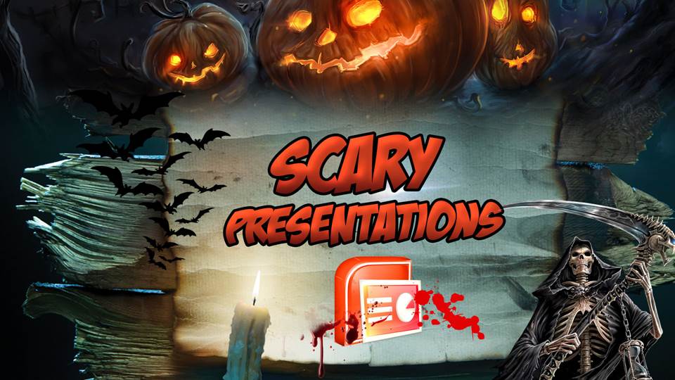
Bullets kill. And so do bullet points…sucking the life out of audiences, who stare like zombies into the abyss of the grey and heartless projection screen while a mummy-like speaker recites mind-numbing paragraphs of text. So as the cool autumn winds blow, let’s open the crypt of ten of the world’s scariest presentations…and share a few magical potions to bring them back to life.

Continue reading

Tips for the best PowerPoint presentations

By Simon Jones

Simon Jones explains how to create effective slideshows in Microsoft’s market-leading tool – and keep your audience from boredom or nausea

When you’re designing a presentation, it’s tempting to make it as whizzy as possible. After all, PowerPoint offers plenty of fancy features, so shouldn’t you try to use them?

Actually, no – just because you can perform eye-catching tricks doesn’t mean you should. PowerPoint is a great presentation tool, but it’s too easy to go overboard by adding stuff that distracts from the message you’re trying to convey. The general principle when working with PowerPoint is definitely “less is more”.

Let’s take an example. The act of moving from one slide to another is called a transition, and PowerPoint lets you choose from many different effects. Some of them are subtle, but many are so garish that you risk frightening your audience right out of the door. Preview them all, then pick the one that best matches the message you want to convey, your company’s image and the audience that will see the presentation.

Continue reading

Slide Design 101: The Rule of Thirds

By Scott Schwertly on

RuleofThirdsI am often asked how one can make slides look more engaging and visually appealing. Today, I want to offer up one simple technique that does not require a background in design, or expertise at programs like Photoshop or Illustrator: the Rule of Thirds.

What is it?

Imagine splitting up your slide into 3 equal parts, both horizontally and vertically. You can then use this grid to place and align your subject matter, optimizing the visual experience. You can apply this approach both to how you view your slides moving forward as well as how you take pictures. It’s a simple technique that separates the professionals from the amateurs.

Here’s how you can use it.

Continue reading