Written by Kevin Lerner
10 of the world’s scariest slides and pathetically bad PowerPoint presentations…and a few PowerPoint makeovers and redesigns just in time for Halloween.
Bullets kill. And so do bullet points…sucking the life out of audiences, who stare like zombies into the abyss of the grey and heartless projection screen while a mummy-like speaker recites mind-numbing paragraphs of text. So as the cool autumn winds blow, let’s open the crypt of ten of the world’s scariest presentations…and share a few magical potions to bring them back to life.
#1. Is it a car? Or is it an essay?
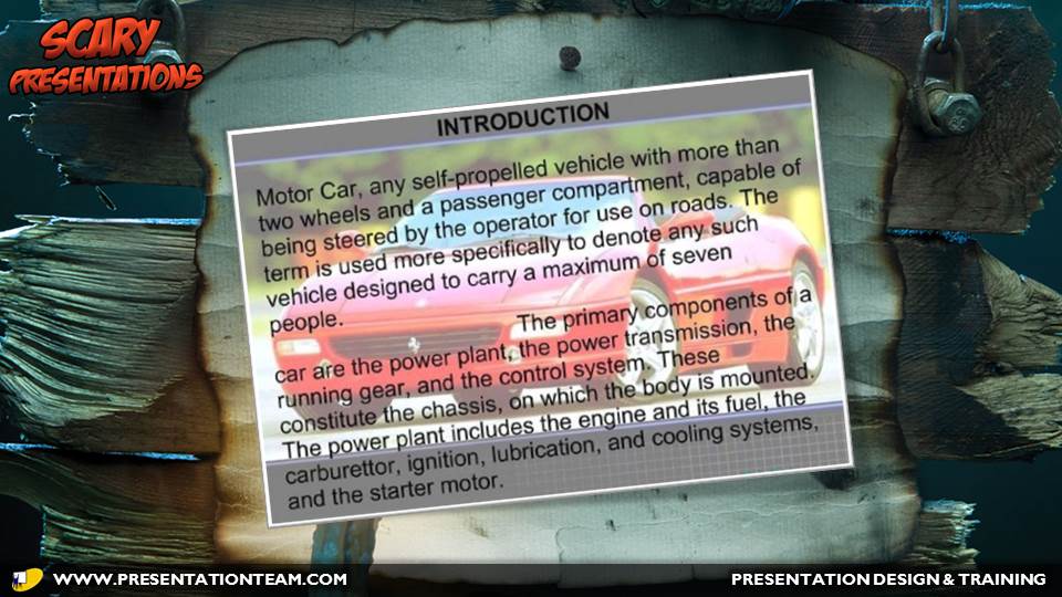
This full-screen muted photo of a Lamborghini is cluttered by five sentences of text explaining the definition of a car. The audience doesn’t know whether to look at the car, the text, or the speaker, Or simply look away in fright.
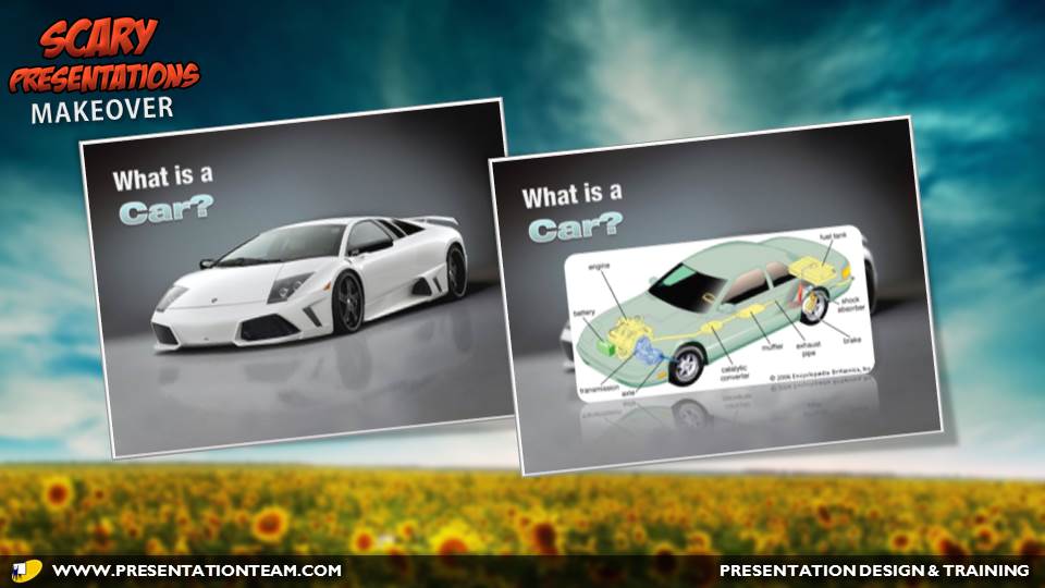
A fundamental fix is to eliminate the text completely- let the speaker talk about it- and create two slides. Slide 1 features a simpler image of the car (a Lamborghini) while the speaker shares a basic definition, as explained in paragraph one. Slide 2 features an illustration of the basic components of the car, as explained in paragraph two.
If the speaker didn’t want to eliminate the text entirely, the photos could be offset to the left, with the text offset on the right.
#2. Strong Brand…Scary Slide!
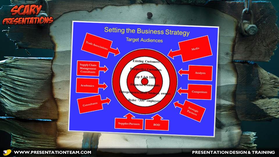
Hopefully, this company’s business strategy is a lot better than their presentations. In the early days of PowerPoint, someone created this curdling mix of arrows, text and a target to explain how 10 elements could target 6 key audiences.
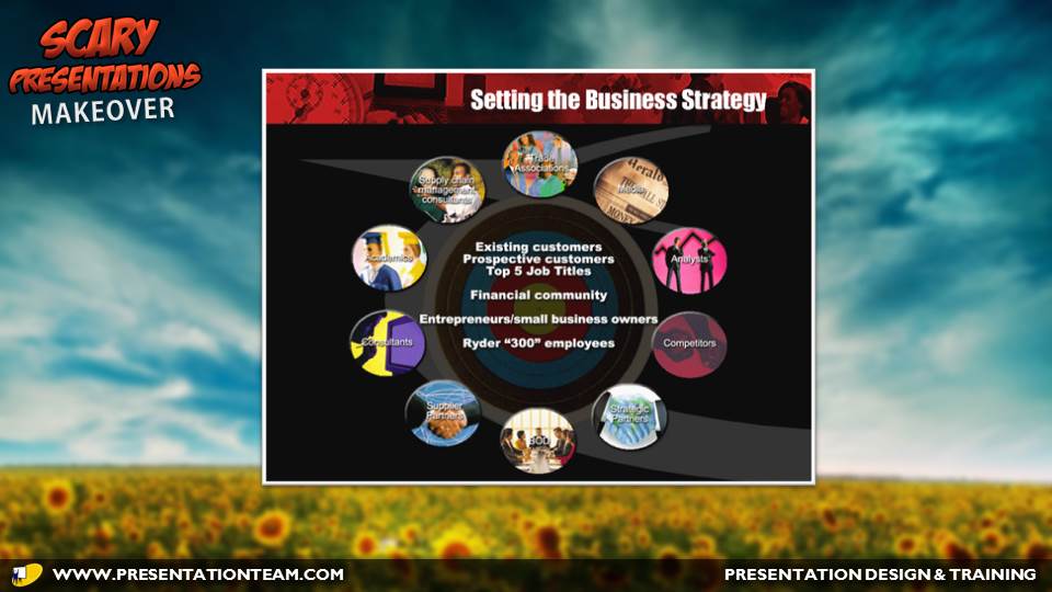
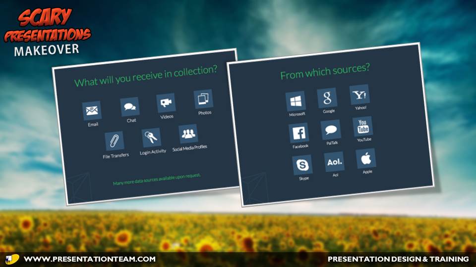
Granted, this image is nearly 15 years old, created long before the ease of Smart-Art graphics. This was one of my very first slide redesigns…and I saw the immediate need to simplify and minimize. I started by creating a simple template using the company’s brand colors of red and black. In the center, I placed a photo of an actual bullseye. And around the bullseye- instead of angry arrows- I worked in Photoshop to create iconic ovals with superimposed text. The slide’s text and message remained the same.
#3. A Potpourri of Praise
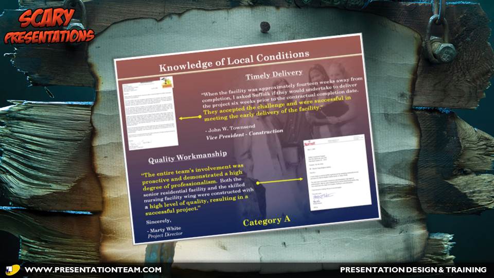
This potpourri of praise may turn a few heads…away! Letters of reference can be helpful in winning a project…but cramming them all one slide is hardly helpful when showcasing success. This construction company’s slide features a mauve/purple gradient background blended with a faded group of schoolgirls. Two recommendation letters in opposite corners are impossible to read…so they’re transcribed in text. But the Times New Roman font is hard to read, even with key words emphasized in yellow. The skinny arrows are meaningless in connecting the letters to the text.
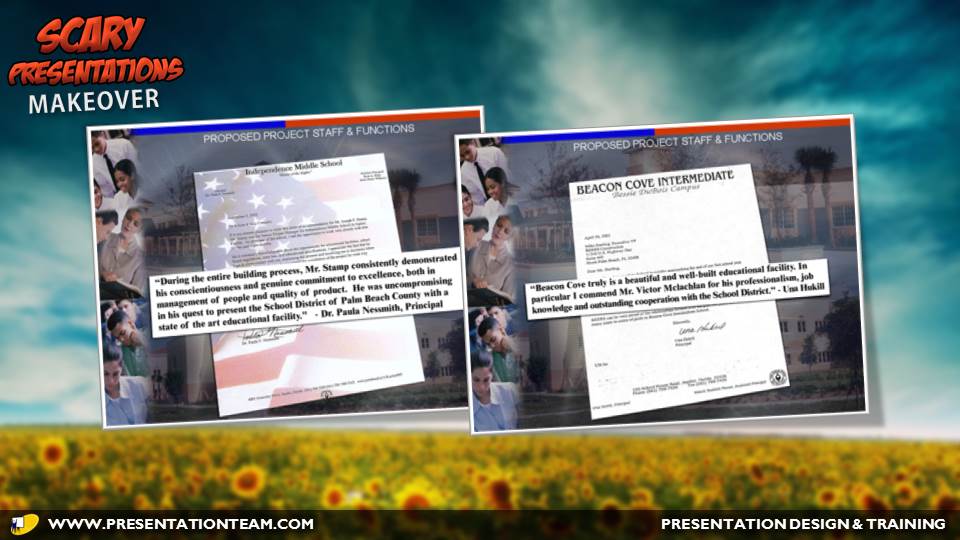
In the redesign of this reference slide, we scanned the actual letters and placed them on two separate pages, angled for depth and improved positioning. A magnified section of the letter showcased the key phrase or message, eliminating the need for manually-entered text.
#4. Bombs bursting in air

This speaker was hell-bent on grabbing his audience’s attention. His stark black background was juxtaposed against a fireworks explosion and an outdated restaurant. The blood red text with yellow shadows made the audience feel as if they were in a McDonald’s war-zone.
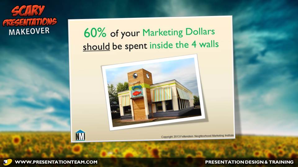
Taming this terror is relatively simple. A quick fix is applying a light beige gradient and inserting a photo of a restaurant with an angled picture style effect. The text becomes black and moves to the top of the slide, with keywords emphasized in green.
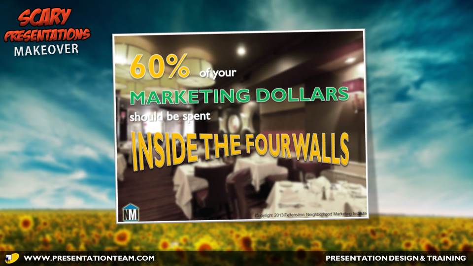
Another approach to subdue the shriek of the slide is to deviate from the template and filling the background with a full page image of a restaurant interior. Image blur and desaturation effects applied. The message is prominent and dominant, with the critical “Inside the Four Walls” message showcased with a 3D text effect to illustrate depth and dimension.
#5. Toxic Snake. Toxic Slide.

Like the venomous Viper snake, this slide the Veterans In Pursuit of Educational Readiness (VIPER) program for Warren County Community College is also toxic. Teeming with text and pouring over with patriotism, the three key bullets on this slide are little more than a script for the speaker or a handout for the audience.
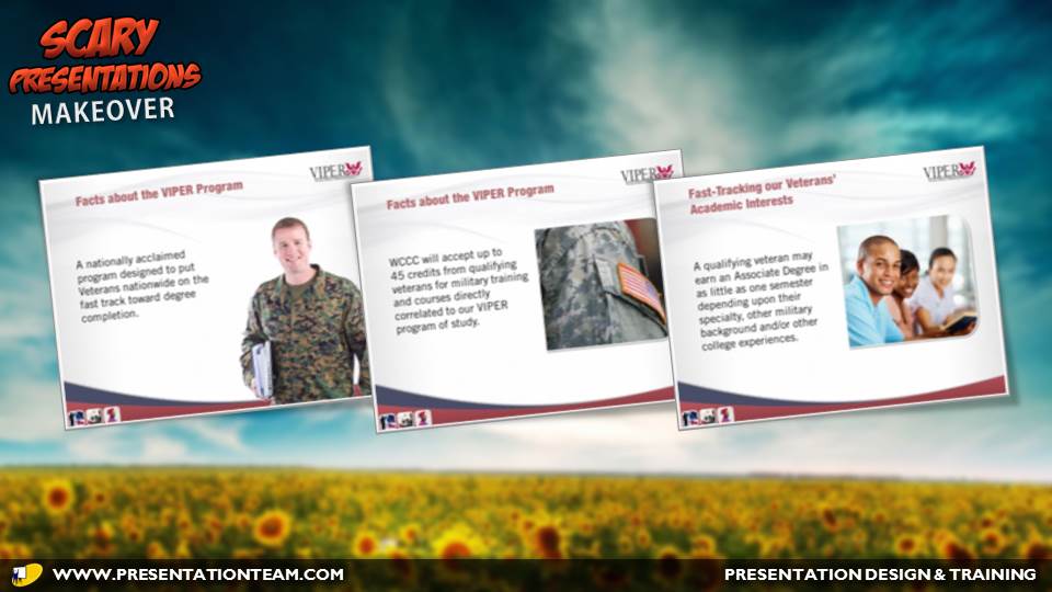
A refreshing redesign of the slide splits the three bullets into three separate pages. The patriotic flair is conveyed in a subdued, red and blue bottom arc created in Photoshop and set against a sandy-white textured gradient background. The VIPER logo is integrated in the top right, and three square academic images carry the iconic military-academic theme. The three slides each feature a prominent image of a student or service member, providing an ardent amount of breathing space.
#6. As boring as the subject

This insurance company’s gloomy slide might as well feature a decrepit homeless person. The ominous navy background with its heavy black text against a fuzzy pie-chart does little to inspire someone to purchase their plan. The red title sends a subconscious message of warning!

The presentation’s redesign is a breath of fresh air. A light and flowing light green and white background features a green subtle element from the company’s logo. All four major bullets have been converted to iconic graphics featuring bold white text with a black border and shadow.
#7. Scary surgery…and slides
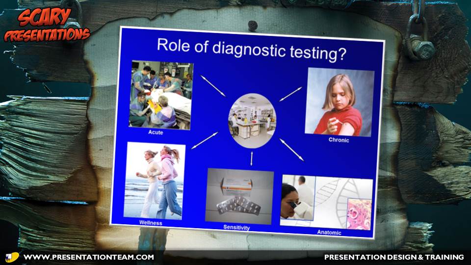
Blood tests and surgery can be frightening…and so is the uninspired layout of this slide. Five unequally-sized rectangles all linked by anemic arrows to an oval in the middle showcase the role of diagnostic testing. The images are busy and hard to see, as are the tiny Arial subheadlines. The flat blue background may put the audience into a trance.

The redesigned PowerPoint slide features five equally sized rounded-rectangles with clear dominant images, defined by Larger-sized subheadlines in Calibri. A transparent clipped PNG graphic of a scientist on the bottom left sends a message for the entire slide of science and medicine. The background is a textured blue angled-line image from Crystal Graphics and edited in Photoshop. A White rectangle block at the top adds contrast and provides space for a concise title and logo.
#8. NSA Security Breach reveals holes in PowerPoint design
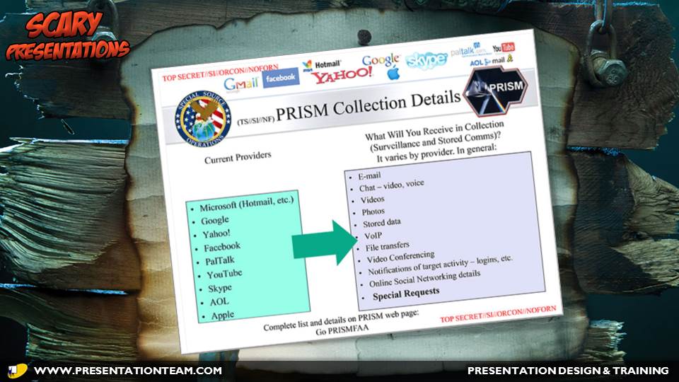
There were many harrowing things about the National Security Association PRISM leak – but to Paris-based designer Emiland De Cubber, the most horrible revelation was how awful their PowerPoint design was. Breaking nearly every fundamental rule of presentation design blended pastel colors, tiny type, and overwhelming amounts of information on its plain white background.
DeCubber stepped up and redesigned several PRISM slides. His philanthropic feat was showcased in Fast Company, as well at http://www.digitaltrends.com/web/whats-with-prisms-awful-powerpoint/#ixzz2hA3kvrsl
#9. Simply complex
This PowerPoint slide is the winner of the InFocus 2011 Worst Slide Contest. It features a mix of text, headlines, arrows, schematics, and directions. Normally, a viewer can grasp the core message of a slide, but this complex and convoluted message spooks the audience.
Even if we could even understand what this slide’s core message was about, the slide could be split into at least 3 or 4 separate pages. A textured background, a clean and simple headline and plenty of white space would help simplify the core message and make this presentation more pleasing.
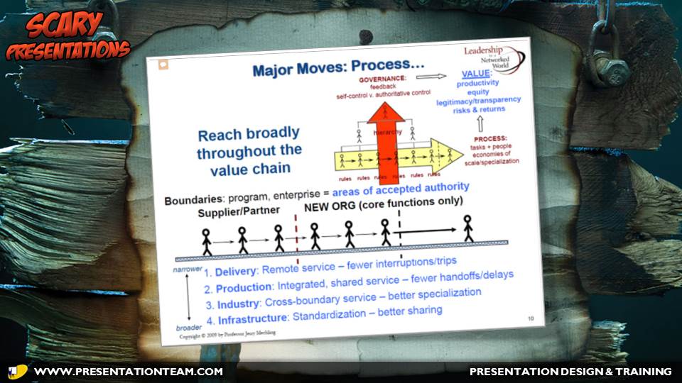
#10. The enemy is…PowerPoint

Featured in the New York Times (http://www.nytimes.com/2010/04/27/world/27powerpoint.html?_r=0) in October 2010, this PowerPoint slide became a catalyst for change in the presentation industry. Designed to portray the complexity of the American military strategy in Kabul, Afghanistan, this scary PowerPoint slide prompted General Stanley McChrystal to wryly remark to laughter and applause, “When we understand that slide, we’ll have won the war.”
The slide demonstrated the mind-numbing strategy of PowerPoint, encouraging many to think outside the box and create more dynamic and compelling messages.
So the next time you see an ugly presentation, consider these opportunities to rise it from the dead.