 By Gcfelizabeth
Highlight large images
Many PowerPoint slides include placeholders for inserting images. Most of these placeholders are pretty small in comparison to the entire slide. While using these placeholders lets you place text alongside your pictures, it can also detract from the power of your images and make all of your slides look the same. If your presentation includes important images, try making them cover the entire slide. While you won’t be able to include very much text on those slides, displaying the right image can be an effective tool to reinforce an important point in your presentation. Plus, it just looks better, doesn’t it?

One word of warning: This only works if your images are large enough. In order for the image to display at full quality, it has to have the same resolution, or number of pixels, as your display. Otherwise, the image may look stretched or blurry. For more information on choosing the correct image size, check out this useful blog post from Microsoft. The post is a little old, but it’s still accurate.
Use interesting fonts
You might already be familiar with PowerPoint’s theme fonts. Each PowerPoint theme includes a pair of fonts — one for headings and titles, and another for bullet points and paragraph text. Including more than one font is key to making your slides look well-designed. However, many of the default font pairs are a little bland. Why not use some different fonts?
Websites like DaFont and FontSquirrel have thousands of beautiful fonts you can download for free, and the Internet is full of resources to help you learn how to choose which fonts to use. You can even find plenty of suggestions for font pairings that work well (Google “font pairings” for more ideas). Once you’ve found some fonts you like, you can even customize the PowerPoint theme fonts to include your favorites.
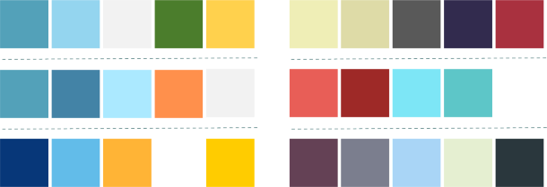
Create your own color scheme
PowerPoint themes also include pre-made sets of colors. Like the fonts pairings, many of these color sets are a little bland. Why not use some colors you really like? Colour Lovers is a great resource for modern color palettes that looks great. You can also copy the colors in an ad or illustration that you like. Don’t use more than four or five main colors, or your presentation will look busy and disorganized. Just like with theme fonts, you can also create custom theme colors. Here are some color combinations I’ve used for presentations at our office: